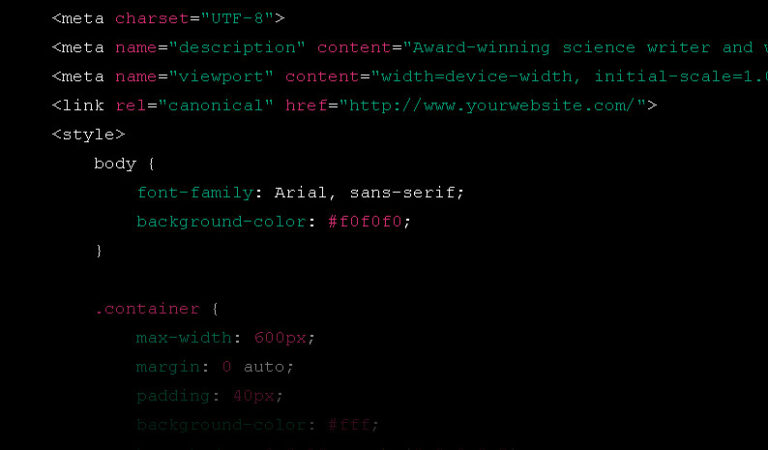
TL:DR – I prompted ChatGPT to redesign and recode the Sciencebase homepage.
You can get some interesting responses from everyone’s favourite language model, ChatGPT, if you give it a special prompt that tells it to act in a certain way. I have been testing this for months, but recently, I have also been toying with the idea of creating a minimalist homepage for the Sciencebase site and needed some HTML inspiration. I hand coded my first website in December 1995, so I thought it was about time something else did the heavy lifting for me…so…here’s the initial prompt I gave to the chat bot.
You are to act as a genius web designer. I would like a very simple, minimalist landing page to include a link to my main website from my root domain name and to describe briefly how I am an an award-winning and experienced science writer. I enjoy wildlife photography in my spare time and performing music with two different bands and a choir. You should provide me with the complete minimal html code.

You can see how the new minimalist homepage this generated code produces looks right here.
I later asked ChatGPT to once again act as an expert in web design and html and to give me a rationale for designing a minimalist and fast-loading web landing page for the site. This is what it had to say:
- Define the purpose and goal of the landing page: Before starting the design and development process, it’s important to understand the purpose and goal of the landing page. Is it to collect leads, sell a product, or simply provide information? This will help me determine what elements to include on the page and how to design the layout.
- Choose a minimal colour scheme: Minimalist designs typically use a limited colour palette. I would choose a colour scheme that complements your brand and is easy on the eyes. It’s important to keep in mind that too many colours can distract users from the main message.
- Simplify the navigation: Navigation should be straightforward and easy to understand. Users should be able to find what they’re looking for quickly and easily. I would minimize the number of links in the header and footer and prioritize the most important pages.
- Optimize images: Images can slow down the loading time of the page, which can be frustrating for users. I would optimize images by compressing them and reducing their file size. This will help the page load faster without sacrificing quality.
- Use clean HTML code: Clean HTML code can help improve the performance of the page and make it easier for search engines to crawl. I would use semantic HTML tags and minimize the use of unnecessary code. This will also make the page more accessible to users who rely on screen readers.
- Prioritize content: The content on the landing page should be clear and concise. I would use headings, subheadings, and bullet points to break up text and make it more scannable. The most important information should be placed above the fold, so users don’t have to scroll to find it.
- Optimize for mobile: More than half of web traffic comes from mobile devices, so it’s important to design the landing page with mobile users in mind. I would use responsive design techniques to ensure the page looks good on all screen sizes and load quickly on mobile devices.