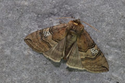
Always nice when someone notices you got a nice sharp and detailed photo. Happened this morning with a snap of a Figure of Eighty moth that was drawn to the actinic lure last night.

This Figure of Eighty moth was shot with a 90mm Tamron 1:1 lens on a Canon 6D digital SLR. Importantly, on a tripod with a shutter release wire, using Live View (on the rear screen, the camera’s mirror is raised) rather than allowing the mirror-raise to cause vibration as happens with a viewfinder shot. Obligingly, the moth lay flat and spread its wings, usually it curls them around its body to make a kind of twig-like tube.
This is a single frame with f/13 aperture, 1/90s shutter speed, ISO 500.
I almost always crop the original frame to get a nice composition. I adjust the levels/histogram to blacken the blacks and whiten the whites slightly. I always lift the mid-tones slightly to soften any shadows on these kinds of shots, but nothing more than about 10-15 percent values.. I also pull down the highlights slightly if there’s been any blowout. Increase the saturation a tiny bit and apply a gentle standard sharpening. All in PaintShopPro.
The final crucial step for social media upload sharpness is then to resize the frame to 2048 pixel width. There’s no point in posting full size to Facebook or Instagram as their compression algorithms do something horrendous to bigger files and you end up with more artefacts and a less clear, less detailed image. After this resize I may up the vibrancy (which is a more subtle variation of increasing saturation that only boosts certain pixels to make the colours “pop”. I then apply a fairly subtle unsharp mask. If the image has been cropped to less than 2048 but not smaller than 1000 or so I apply the same unsharp. If it’s < 1000 I’ll pull back the unsharp a lot.
I then add my dB/ logo in the right-hand corner. As you might have noticed, there wasn’t room for the logo in the pre-processed image, so I rotated it and clone the stone background to fill the resulting gaps and then added my logo. I think it usually gives me a half-decent end result.
Here’s the original frame straight out of the camera, saved as a 90% JPEG rather than RAW, I rarely shoot raw…it was cropped and resized to fit the page here. It’s sharp (in focus) but dull and lifeless.
