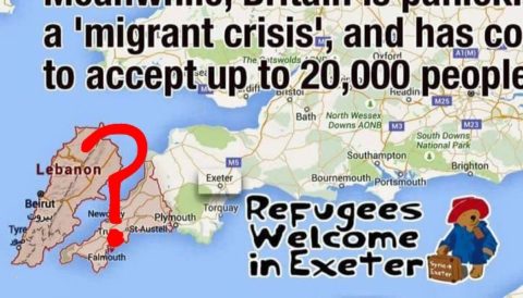
You may have seen a graphic doing the rounds and offering support to the very worthy “refugees welcome” campaigns. The graphic, which actually started circulating in September 2015, says that:
"Lebanon, a country barely the size of Cornwall, is currently housing two million refugees" and that Britain is panicking over a "migrant crisis" and has "conceded to accept 20 000 people by 2020"

I get their point, but it’s badly made, the creators of the graphic presumably didn’t learn much about maps in geography lessons at school and specifically about the inherent distortions of the Mercator Projection. Fundamentally, in a Mercator projection, which was designed to make life easier for navigators and sailors and not for comparing land area foreshortens countries the closer you get to the Equator. This is not a trivial point and has repeatedly led to countries further south than Europe being perceived as somehow less important because they don’t seem as big.
The current campaign graphic is a case in point. Although Lebanon does not look much bigger than Cornwall when cut and paste next to that English county, it has an area of 10 452 km2, almost three times that of Cornwall’s 3 563 km2. Lebanon is roughly the same size as Cyprus, Gambia, Jamaica, Kosovo and Puerto Rico and about half the size of Wales.
Now, none of this is to say that Britain couldn’t accept more refugees, but there are lies, damned lies, and Mercator Projections. I’m surprised opponents have not latched on to this point and spun their own geographical distortions, to be honest.