First posted 2006-09-06. Updated 2023-01-23
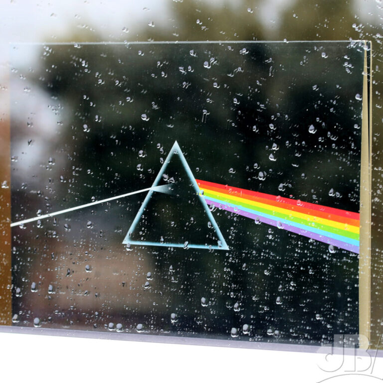
2023 is the 50th anniversary of Pink Floyd’s “Dark Side of the Moon”. You’ll know it instantly from the cover art which shows a prism splitting a ray of light into a rainbow. I grew up with this album, but I must admit I didn’t remember noticing that the rainbow has just six colours. Don’t we normally think of rainbows as having seven – red, orange, yellow, green, blue, indigo, violet?

Interestingly, the six-colour rainbow has been a pride symbol for the LGBTQ+ community for many years. I wondered why that it didn’t have all seven colours either…was it something to do with the suspicion that confirmed bachelor Sir Isaac Newton was maybe gay? Probably not.
Anyway, the Floyd recently updated their socila media logo. The logo features the six-colour rainbow motif, just like the original album artwork. It triggered a load of bigoted comments and ignorant trolling [for which read: free publicity]. The trolls hated that their Pink Floyd had gone all “woke”. Well, aside from the fact that being woke is not a bad thing, the Floyd were woke long before anybody used that word to mean tolerant and accepting. Indeed, the whole album is lyrically about as woke as you can get without propping your eyelids up with matchsticks and wrapping yourself in a rainbow flag, and shouting “right on!”
But, trolls will be trolls, the endless antiwoke and bigoted bile spat out about the new artwork and the rants from people saying they will never listen to the band again is just incredible.
Better antifa than antiwoke I say. Shine on!
Original Post
Everyone knows the song…
Red and Yellow and Pink and Green, Orange and Purple, and Blue…
Not exactly the best mnemonic for recalling the rainbow, that purple should be “violet” after all, and then there’s the little problem of “pink”!
Much better is my late mother’s VIBGYOR (violet, indigo, blue, green, yellow, orange, and red) as cited in Newton’s famous prismatic experiments. Although some people prefer Richard of York gave battle in vain.
There is a problem. Where is this indigo? Can anyone really distinguish between violet and blue? To my eye, there certainly isn’t a jeans-coloured slice in the spectrum, and as chemist M. Farooq of the University of Karachi in Pakistan suggests this isn’t due to limitations of the prism. An article in the American Journal of Physics (1972, vol 20, p 526), he points out, drew attention to the fact that indigo does not exist in the spectrum some years ago and that instead was nothing more than one of Newton’s “preconceived notions”.
According to that AJP paper, Newton adapted the colours of the artist’s wheel – red, orange, yellow, green, blue, violet, and purple and then added something from his religiosity and his alchemistical bent. The number 7 after all is more heaven than the 6 of hell. Newton gave us the seven colours of the rainbow not because there are seven but because it fit his view of God’s universe better.
The indigo of our mnemonic is actually violet, and what Newton referred to as violet is probably what we call purple. Of course, purple is not present in sunlight but is a colour of mixed pigments on the artist’s wheel. More to the point though, there aren’t just seven colours. The electromagnetic spectrum is just that a spectrum, a continuous spread of hues in the visible and beyond.
All that said, some people do see seven “main colours” when prompted, some people do see a colour between purple/violet and blue in the rainbow.
Meanwhile, here’s the tech bit from the US National Bureau of Standards showing the range of wavelengths of light corresponding to the colour:
400-465 nm violet
465-482 nm blue
482-487 nm greenish blue
…
…
597-617 nm reddish orange
617-780 nm red
It’s all very well laying down the colourful law like that, but your idea of “reddish” might be slightly different from mine, in fact I might see orangey-red when you perceive reddish-orange (maybe it’s another example of the ambiguity in art I discussed recently in this blog). Moreover, as John Denker points out, there is a “band” between yellow and green that if the word chartreuse is in your vocabulary you might label it as such. “The question is not whether the band is there, but whether the observer chooses to take notice of it,” he says. “This whole colour-naming issue depends relatively more on cultural and behavioural factors, and depends relatively little on physics,” he adds.
On the same discussion group Thomas O’Haver of the University of Maryland asks, “Is there really in value in having students memorize something like this?”
It still doesn’t help much with the words of that song, though, Red and yellow and pink and green…
