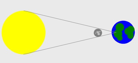
This diagram is an approximation of how BBC children’s news program “Newsround” (formerly John Craven’s Newsround) showed how the recent annular eclipse occurred.

Now, there’s simplifying and there’s just getting it totally wrong. I assume that they checked on Wikipedia for how eclipses occur because no one on staff had done a GCSE in science and simply misconstrued the diagram there. If someone on staff did study science at school, then they ought to be ashamed of themselves.
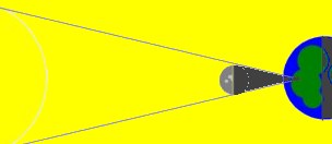
This is closer to what it should be:
